Tuesday 1 October 2013


Sunday 29 September 2013

My Proposal
My Proposal
I am creating a CD cover, for the artist I have made up, ‘Allie Wilding’,I have based this character on the music artist, Ellie Goulding. I would say the genre is pop, but very subtle not that many upbeat song. Other artists that are similar, Adele, Gabrielle Aplin, Birdy.
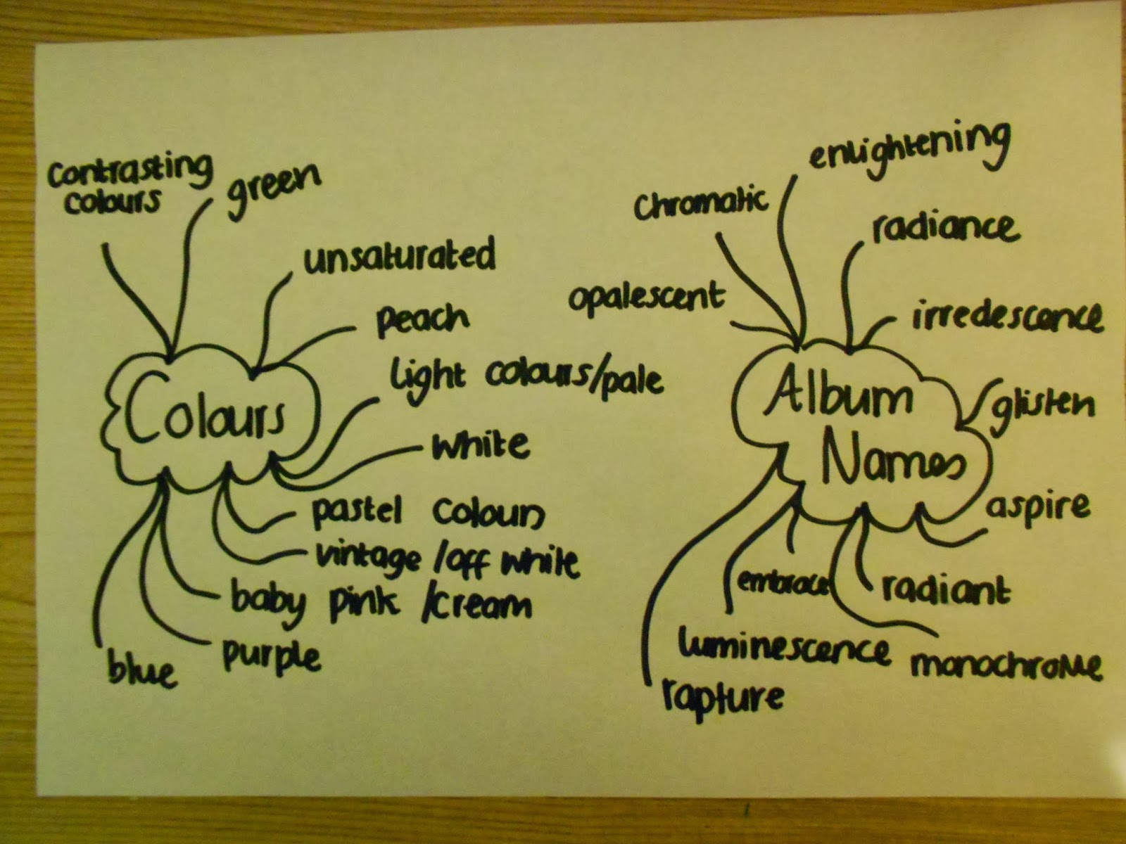
After researching different words on online thesaurus, I have chosen ‘Awakening’. It will have an impact on the design, as I am going to make it a relaxed atmosphere and kind of mysterious in some way, but also light and joyful.
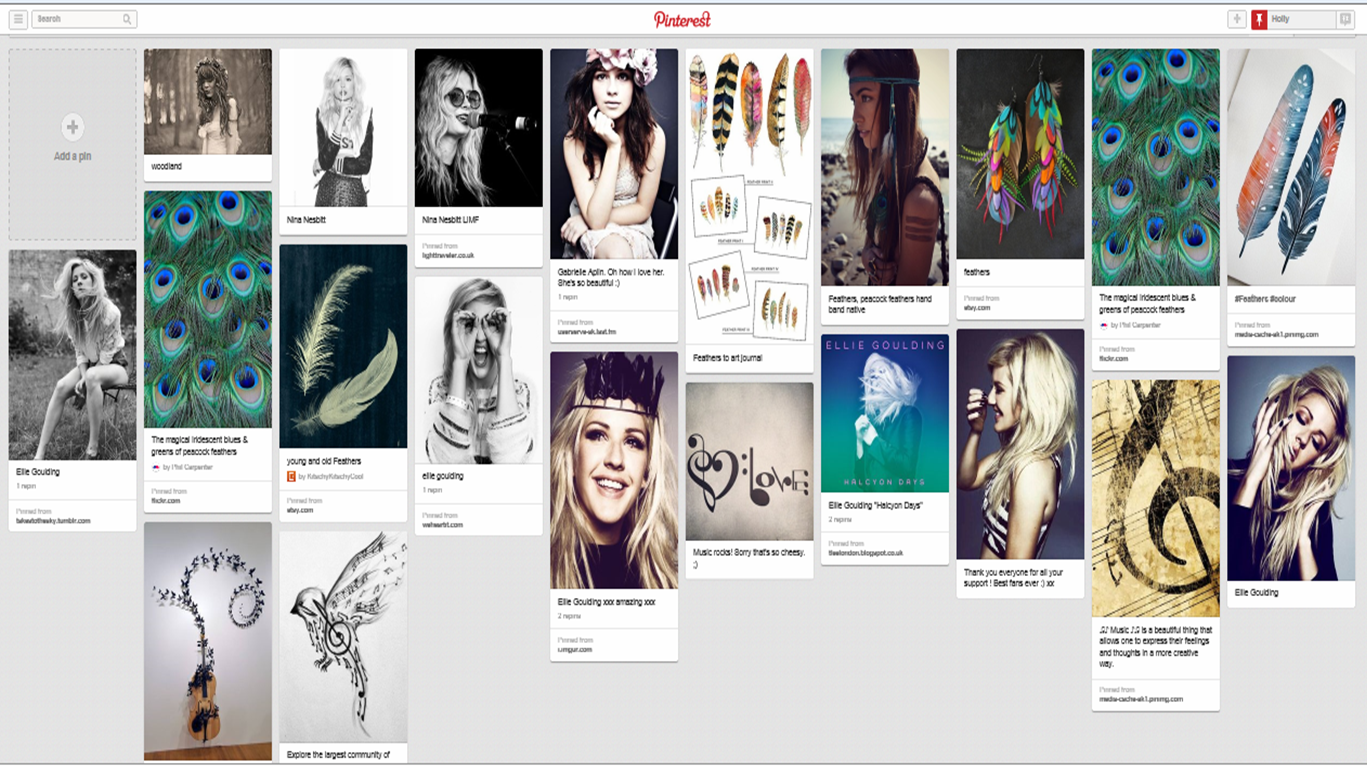
I will take my own photographs using a friend as a model, i will use voyeurism to create a relaxed, joyful feel to the CD cover. I want to create a boho chic look on the model and have a natural, fresh, outdoorsy atmosphere.
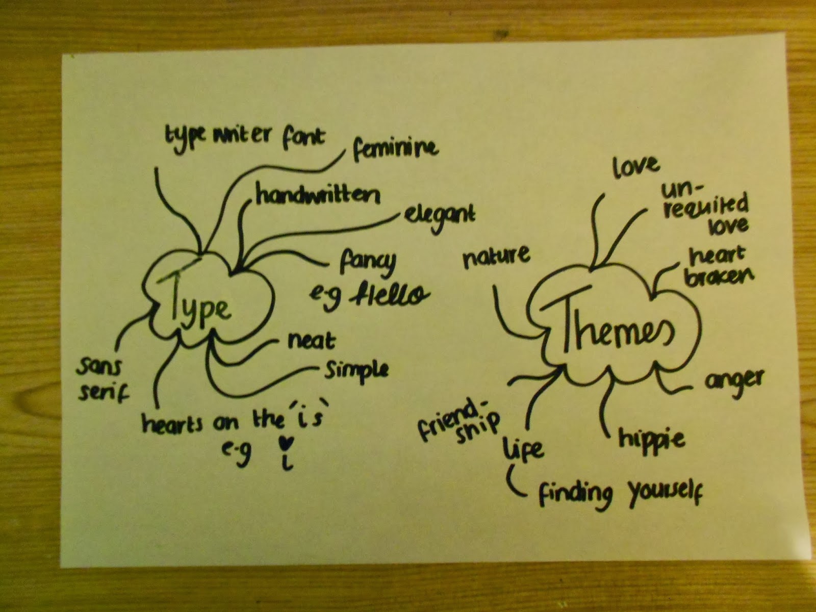
I want to use, monochrome, and black and white pictures mostly, with some saturated, but bright colours at the same time added into it. I will also use warm colours as my album name is ‘Radiance’, so oranges, pinks, purples. I don’t want it to be too dull or dark colours.
I will try and have most of the same conventions as you find on a normal CD cover, but I might try and avoid using too much information on the back, such as websites and music record producer text.
For the front I will take my own pictures, I want them it in black and white mostly, but with some other colours. I want the mise-en scene for the photoshoot, to be outdoors with vintage flowers and furniture outside with nature. The model will be wearing vintage clothing, lace, denim maybe, I also want to use feathers somewhere as that is what I want as the back artwork, maybe put some in the model’s hair.
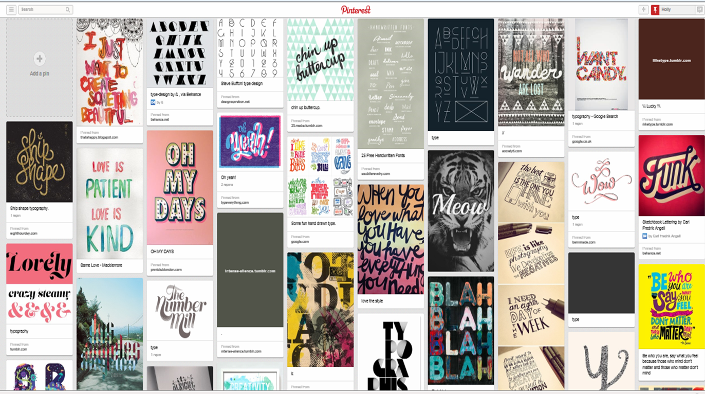
The type i want to use needs to look handwritten and simple, but effective.
The institutional will be placed on the back, such as barcode, websites and the tracklist will be on the back. I don’t want much on the front apart from the artist’s name and the name of the album, because I don’t want it to spoil the relaxed, laid back, handmade feel of the front cover.
Saturday 28 September 2013
Genre Conventions
Genre and Design for Music
Genre
|
Typical conventions
| |
 * * |
Jazz
|
First of all, the ‘Jazz’ album artwork does not normally consist of many colours and also red is used quite a lot. There are many abstract shapes and patterns used as well, to create a more interesting appearance. The fonts are usually simple, so it will be easy to read from a distance, but eye catching as well. A lot of them have instruments in some form on the front, whether it be a picture or drawing, mostly trumpets.Quite few of them have people on them, but drawn in a picasso kind of style, not generally real people. A mixture of hot and cold colours are used, reds, oranges and blues, being very popular.
|
 * * |
Blues
|
Again, most of the fonts used are simple, to be readable from a distance, but also stand out at the same time. Yellows, blues and sometimes oranges are used regularly. Most of the ‘Blues’ album covers have a photograph of a musician on the front, most of the time playing an instrument or just looking away. Quite a few have images of or people playing instruments such as guitars and trumpets.The colour blue is the main colour used as it represents the name of the genre. There are not that many drawings or paintings, quite a lot have photographs of people and musicians.
|
 * * |
Dance
|
To start of, nearly all of the dance albums use a rainbow of vibrant colours, to give off the exciting, energetic vibe. A lot of them also have indecently dressed girls on the front to maybe give off the impression that you will be like them if you listen and dance to this music. Quite a lot of the album covers have techno patterns on, such as light strobes and cube patterns. Many of them also have glitter on the front to give it a more glamorous feel. A lot of the dance album covers have quite large font which is easy to read, sometimes in block writing.
|
 * * |
Pop
|
Some pop albums use a rainbow of different colours, for example the one to the left, whereas others have limited colour use using just one or two colours. Most of the album covers have a photograph of the artist, close up which fills near enough the whole cover. If this is the case then they will usually just have the name of the artist in a simple font and maybe the name of the album. But some others have drawings and patterns on which use a variety of different colours. The font on these sort of pop covers are more of a display font, which is a lot more interesting to look at.
|
 * * |
Boy Band
|
Most boy band album covers have a photograph or image of all the band together, normally in a certain order. Some have the picture of the band having fun together, or other are just of the band posing together. The font on the boy band covers are normally their own personal font which everyone associates with them, or even their logo. Most of them have limited colour use, blacks, blues and greys, with the occasional bits of colour. But some such as the one to my left have a brighter variety of colour choices.
|
 |
Rap
|
Most of rap album covers have the ‘Parental Advisory Explicit Content’ sticker on as most rappers use bad language. A lot of the covers have close ups of the rapper, normally with moody facial expressions. A lot of the time they are also wearing bling and jewellery such as rings and necklaces. Many of the rap covers don’t use very many colours, mostly blacks, greys and reds.Quite a lot have tattoos and wear hats or sunglasses. The font is usually block writing, nearly always in capital letters, but also some fonts used are supposed to look like graffiti lettering as well.
|
 * * |
Rock
|
On many rock album covers, bright colours are used, but there are also some with neutral colours too. A few have dangerous symbols, such as lightning and spikes on the front. Some albums use different artwork from spaceships to monsters.The font used on most of the albums, is pointy again to represent spikes and danger. Many of the covers have an older feel to them, sometimes retro. Quite a few use angry colours which represent fire such as reds and oranges. Some have cartoon drawings of the bands on also.
|
 * * |
Country
|
Many of the country albums use neutral colours, such as browns and greens, colours which you would find outside to give it a more natural feel. Quite a lot have pictures of the artists outside near nature such as grass and trees.Many of the fonts look old fashioned. Many of the artists photographed are wearing cowboy hats.Some are playing instruments. A lot of the covers, feature wood into the cover some way as well.
|
Subscribe to:
Posts (Atom)